Ramen & Gyoza: from concept to finished card
It's no secret that I'm a ramen lover. When I lived in Japan, I ate ramen pretty much every week; paired with gyoza, it's the perfect meal on a cold winter's day. When I started making cards, I knew that I wanted to draw ramen, but didn't have a good punch line. For a year I let the idea brew slowly in the back of my mind; meanwhile, I began to take reference photos every time I went out for ramen and gyoza. (Most of the time, it also involved Kirin or Sapporo beer.)
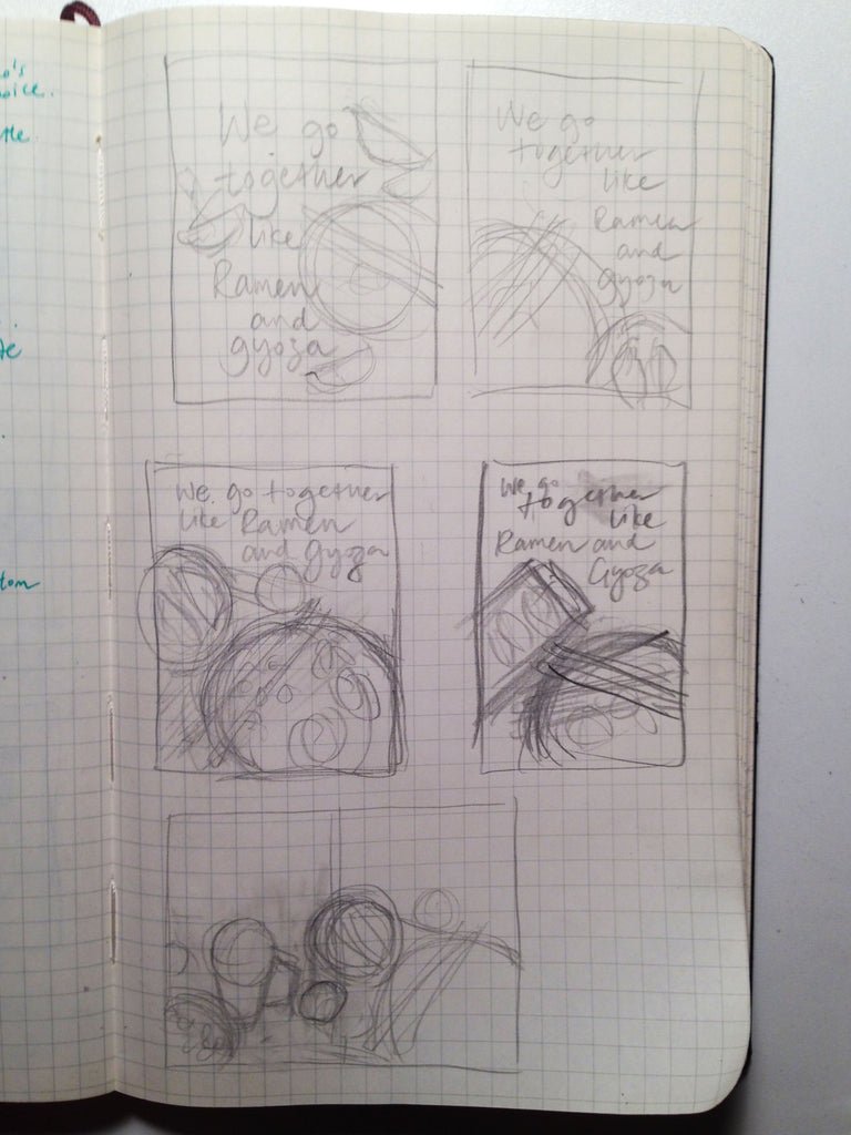
Ideas often come to me in the shower, and this one was no different. One day, I was drying my hair when I realized that there's always been a simple, understated love between ramen and gyoza. Bingo! Once I decided to go ahead with the card, I worked out the composition in my sketchbook with thumbnail sketches.
You can see that I tried several different ways to layout the text with the image. My breakthrough came when I realized that I didn't have to fit the entire plate of gyoza on the front of the card; I could instead wrap the tableau to the back. Now that I was finally happy with the composition, I began the draft.
From the ink draft (above) to the final (below), I tweaked the composition even more, replacing the spoon and chopsticks with smaller round dishes to balance out the strong lines of the gyoza and chicken karaage plates.
Once the ink is dry, it's time for my favourite part: adding colour. This is where the drawing comes to life.
Now that the illustration is done, it's time to start the hand-lettering. I treat the lettering as a part of the entire composition, and for this card, I opted for a flowing, calligraphic style. I love the quality of lines inked directly on paper, and not traced; I find that traced letters lose their energy. Sometimes I write the same word over and over on a couple of sheets before I'm happy with one. The word "gyoza" has a lot of loops, and was particularly fun to practice.
The illustration and lettering are scanned, edited and formatted on the computer, and brought to the printshop for printing. (That process is a whole other post that I'll write sometime.) Here's the finished card:
Overall, I was really happy with how this card turned out. I think the wraparound works quite well and will probably do more in the future. Some people might dismiss greeting cards as trivial, but it's a real joy for me to think of the entire card, front and back, as a complete piece of art.


